As a eCommerce seller, having full control over all aspects of your store’s design is vital and desirable.
One vital and surprising example for it is the Shopify Checkout page. It is the key deciding factor for your revenue by making sure that customers reaching this page will complete purchase and not drop off.
Especially if you are facing problems with drop-off customers, or multiples customer abandoning carts, this might just be the solution for you.
In this article, we will guide you through how to optimize the Shopify Checkout page for urgency and trust & effectively solve those problems, even if you are only a beginner.
Let’s start!
1. How to Edit Your Shopify Checkout Page
Though the Shopify checkout page is optimized for conversion, it is obvious that it has a simple layout and design. Therefore, it is smart to customize it to leave a better impression and keep the sales funnel going.
Its basic layout can’t be changed but you still do have some control over how the checkout looks by using these methods:
Using Shopify Setting
- In your Shopify Dashboard, let’s go to Settings > Checkout
- Enter the Style section
- Click Customize checkout to open the theme editor.
Below are a list of everything you can control from the Shopify checkout setting. For step-by-step details on how to edit these, also visit our Help Center.
- Banner Image: You can upload a custom image that reflects your brand. Generally, a 1000 by 400 pixel image is highly recommended.
- Logo: It is better if you include your brand’s primary element on your checkout page. You should make sure that your logo is clear and easy to see. Some store owners also use this position to include a tagline, slogan or other messaging.
- Logo size: This option lets you select how big or small the logo is. Because “small” and “large” are quite arbitrary, it’s a good idea to test the logo size.
- Main content area background image: You can create the main content area on the left and integrate how it looks and feels. This image will repeat both vertically and horizontally, so selecting tiled options will be better.
- Background color: If you don’t have a background image, let’s select the background color for the left column to color your checkout page.
- Form fields: You can choose either transparent or white.
- Order summary background image: You may also include a background image behind your store’s order summary column. However, it is best to keep this image light and simple.
- Background color: If a background image is not used, select the background color of the order summary area.
- Typography: There’s a limited number of fonts that can be used but you can choose one of them for all headings and all body copy in the checkout.
- Accent color: Accent color is used for links, checkmarks and highlights in the checkout area. You can pick a color that is considered prominent in your brand and contrasts with background images or colors.
- Button color: Button color is the background color of the discount, gift card and next step buttons. This color should be bold and high contrast for legibility purposes.
- Errors color: Error color is for warnings and invalid field errors. Red is used popularly so it will be a choice. If you’re using a dark background, it can be difficult to get attention.
Add Code To Checkout File
If you are a Shopify Plus merchant, the checkout.liquid and checkout.scss.liquid assets will be available for you to edit.
5 steps to edit Checkout file in Shopify Plus store
- In your Shopify admin, go to Online Store – Theme section
- Click “Edit Code”
- Choose checkout.liquid file (or checkout.scss.liquid file for style) to make necessary updates
- Click Preview to view the changes done
- Click Save to complete the process.
2. Strategies To Tweak And Modify The Shopify Checkout Page
As we mentioned above, one of the main restrictions of the Shopify checkout page is that there are limited changes you can make, even when you have used the Shopify setting or checkout file.
Believe us, there are still some interesting ways to modify these pages more standardly and easily on the eye, using Third-party apps.
Increase urgency by adding a Countdown Timer
A checkout timer can help create urgency to push your visitors to finish their purchase right away. With a countdown timer app like fera.ai you can add a great checkout timer to your checkout page.
You may change the wording of the countdown timer in the app to fit your store’s needs as well as set up a personalized urgent message for when the timer runs out, which is a great way to try and get the customer to convert immediately.
Add Payment Safety
Allowing customers to see what type of credit cards and other payment methods they can choose will help provide trust to them.
However, the Shopify checkout page doesn’t indicate what payments are accepted on the first checkout page of the checkout and a customer could not see a MasterCard logo or Visa logo anywhere.
Using apps like Modemagic or the TrustedSite app allows you to add payment safety on your Shopify store’s checkout.
Besides, you also may insert an image within the badges via the Checkout customization page in your Shopify dashboard settings.
Learn more:
What is Shop Pay and Is It Safe?
Shopify Collections: A Complete Guide (2022)
How to Connect Your Shopify Store to YouTube?
10 Creative International Women’s Day Campaign Ideas
12 Best Mother’s Day Marketing Ideas For Your Online Store
How to Set Up The Shopify eBay Integration?
Add Trust Badges
There is still a ton of blank space we could utilize on the right-hand side under the order summary and you can definitely add trust badges to this space.
With those badges, you will really increase your store’s trustworthiness with customers and make them aware of your store differences (like a satisfaction guarantee, easy track your status)that will help them complete their purchase. You can easily find such trust badges on apps.shopify.com or Free Trust Badge by ShopClimb.
So now you know how to customize your Shopify checkout page for urgency and trust. Another important page you should also customize for greater revenue comes right after the Check out page is the Shopify Thank you page.
3. Things You Need to Know About the Shopify Checkout Page
What Are Shopify Checkout Pages?
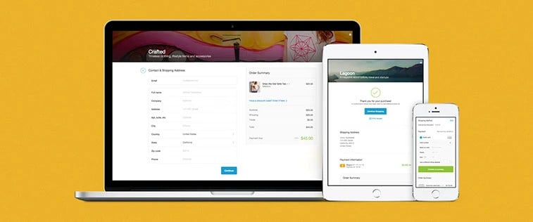
Simply, Shopify Checkout Page is where to accept orders and take payments. After customers add products to a cart and click the “checkout” button, a popup-style cart will appear for them to enter their shipping information and payment details before placing the order.
Learn more:
How to Do Free Shiping on Shopify? (+Evergreen Tips)
How does Shopify Shipping work: Easy Set-Up Guide, Tips and Tricks (2023)
Shopify Checkout Page highly accelerated conversion with Shop Pay, which allows 60% faster in speed. It also offers a sales subscription as well as an exceptional optimization for mobile (70% of shoppers buy on mobile according to Mobile eCommerce Stats). Therefore, the Checkout Page will never be down even if the number of customers lining up is too crowded.
As other Checkout Pages, Shopify Checkout Page allows shoppers to buy with local payment methods, including multi-currency and digital wallets.
Elements of a Shopify Checkout Page
The Shopify checkout page has a lot of the elements that make it best for a high-converting user interface. Here are the key factors having an effect on optimizing conversion rates that you ought to pay attention to.
- Call To Action: The call to action is the most visually striking element on the Shopify checkout page, which helps to ensure the user is propelled forward in the checkout process.
- Reasonably Organized Layout: Beyond the primary call to action, the layout whose position and visual attributes are organized in a logical way is also highly optimal. For example, the “Continue to shipping” button itself is created to insert into the information hierarchy into the checkout page layout by Shopify’s designers.
- The Workflow Helps Orient the User: Normally, the checkout process requires a lot of input from the user (shipping, payment, etc) and any frustration might lead them to abandon the checkout. Shopify has cut out any unnecessarily extraneous functionality to decrease “friction” in the checkout process.
?. Bonus Tip: You can also optimize every page on the Shopify theme including the about us page, blog post, product page, etc. So don’t hesitate to check out our entire tips to fully customize your Shopify theme that converts!
One reply on “Customize the Shopify Checkout Page: 3 Ways to Increase Urgency and Trust”
Hello, I would like to build a gift card payment on the Checkout page, how can I do the following?
1. Prompt customer to input card no and pin
2. Forward the order details to gift card processor
3. After approved in giftcard processor, update the paid status to Shopify