Good order is the foundation of all things. Having a neatly organized website means a great browsing experience for visitors, which ultimately translates into greater benefits. In this article, we will guide you through the two basic tools to construct a design: grids and alignment.
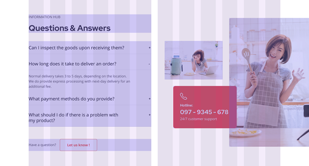
Knowing what it is, how it works, and how to best implement it, your Shopify store will turn out just as magnificent as this Caleno Drinks website we have below!
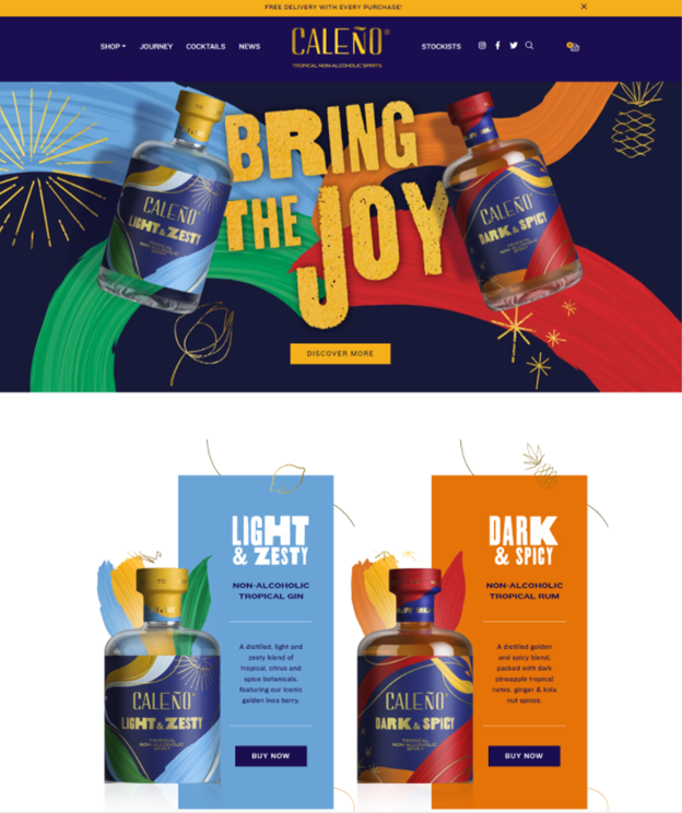
Great symmetry, dynamic visuals, captivating text, and CTA – The Caleno website makes it easy for readers to navigate, explore, and finally – buy the product.
Create the store structure with grids
We already talked about how a well-organized web design can greatly enhance the user’s reading experience. Now the key to that is using a grid – or many grids, as you will explore further in the following parts of this article.
What are grids?
Grids act as a system to help you structure the design content of your website – be it images, words, or any other pieces. Think of it this way: You are building your website out of blocks & a series of containers, and the grid, therefore, is your website’s skeleton. Grids also enhance flexible web design:
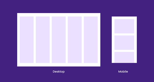
How a simple grid looks like on different devices
With a long history of application – from early manuscript typography to the 20th-century modular approach, the grid system indeed has a great impact on the nowadays modernized era of web design. In case you are still curious, check this article to know more in-depth about the history of grids.
The importance of grids in web design
The human eye skims for order & a flow of consistency. We favor things that are organized & in their place. Grids, as the base structure, give form, create easy navigation as well as shape & hierarchy to any web design. Hence, we can say that grids are never going to be out of style, especially in the world of design. This can be utilized in every niche, for example, attorney web design could benefit from grids that are well-tuned for a natural way the human eye observes.
Grid components
To utilize the use of grids in your web design, it’s important to know what components make up the system. Time for grids’ anatomy!
Unit
Units act as fundamental blocks that build up your grid. The below example showcases a 12 unit grid. Note that each stripe represents one unit.

The 12 column or 12 unit grid.
Gutter
Gutters are the white spaces in-between units. These assure that the overall grid structure is breathable & has nice spacing to it.

Gutters separate each unit from the other.
Column
Multiple units with gutters comprise columns. Columns are exactly what make grids great. You can place your design content within columns & create distinct emphases for the web design layout.
To be more specific, check this example:
There are 4 columns in the example above. Each has its suitable size and spot for different purposes such as images or texts.
Field
Many columns form a field. Apply the same principle mentioned in columns, and we have what fields are: horizontal dissection of your web design layout. Fields as well breathe constancy throughout the entire page construction.
An instance of one field with multiple columns.
Different types of grid layouts
There are 5 types of grid layouts: the 12 unit grid, the 4 column grid, the 3 column grid, the 6 column grid, and the final – mixed grid. Not one is better than another, still, your web design may benefit by using some or all of them at once!
12 unit grid
When it comes to grids layouts, the 12 unit one can only do your web design well. As the name says it, this grid can be a friendly & wholesome solution for starters. With great flexibility, the 12 unit grid can break down into blocks of 3, 4, and 6 columns. Even better, there’s no limit to what you can do – be it safe & simple or complex & dynamic, the lucky 12 can’t do wrong.
The 12 unit grid provides you with many options to design the layout of your online store website.
4 column grid
The 4 column grid is another one you can go with to develop neatness & unity in the web design. Every 3 units make a column in this grid. For how to use it, often, you can use the two middle columns for emphasized content and the remaining for lesser subjects. Otherwise, the 4 makes the structure evenly and well-balanced. This means you can equally put your content into the 4 columns as the following example does:
The even-numbered 4 column grid is nice on the eye, which makes it a good choice for product listings.
One down of this grid is it might be too symmetrical, hence in some cases, a tad bit boring. Yet, you can still learn to use some of the other grids in a mix with this one. The final results would be awesome, we bet!
3 column grid
With this asymmetrical grid, the math is fast done: A 3 column grid has each of its columns spanning 4 units. Advanced skills & more active execution may come in demand, however, when you practice a 3 column grid. No matter what, we advise you to try it out and see how it turns on your page design.
Although harder to tackle, when done right, the 3 column grid can bring interesting balance to your site design.
6 column grid
The 6 column grid has each of its columns spanning 2 units. As you can see in the image sample below, a 6 column grid offers plenty of space. So if you are opting for designing a content-rich site, it would be the right way out!
A 6 column grid is more challenging than a 3 column one. Yet, there’s enough place for you to fine-tune the smaller details and make your site content richer!
Mixed grid
To have a website that is both well-organized and attractive to look at, you should consider the option of mixing some (or even all, reasonably) of the grid layouts. The 12 unit grid comes in very handy – whether blocks of 4, 3, or 6 columns. The decision now is all yours to combine which & what in your design!
The above product page layout applies both the 6 column grids & the 4 column grids in its design. This way, buyers can quickly differentiate sections and skim for their wanted information.
Align web elements
Once you have mastered the use of grids, it’s time to get your hands on how to align elements within that grid.
What is alignment in web design?
Alignment is the act of positioning all elements in your web design. There are 4 alignment options: left, right, center, and justified. All around, alignment is how you communicate & interact with your website users. Hence, learning how different elements relate to each other is the key here.
Since alignment goes hand in hand with the grid system, it’s crucial that you have an outline for your web design.
The importance of alignment in web design
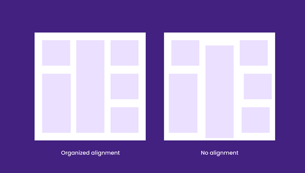
By proper alignment, you are not only filling the visual gap between elements but also building a sense of structure. From a design perspective, structure means clear & neat website interface navigation. For buyers, it signals visual appeal, easier scan & a more calming reading experience.
Basic practices of alignment in web design
Text alignment
As mentioned above, there are 4 options to align elements (in this case, text): left, right, center, and justified. Think of how you align your text in a document. The same applies to text alignment in your web design.
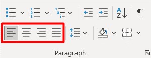
Align text with 4 options similar to Microsoft Word or Google Docs.
Yet, the goal is to examine how the text sits in your design & how a certain alignment placement would affect it. For example, left-alignment is usually the go-to for main body text because it’s simple to navigate, design & read. Moreover, most parts of the world, including America, read from left to right. So it is obvious that often you will see texts left-aligned.
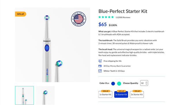
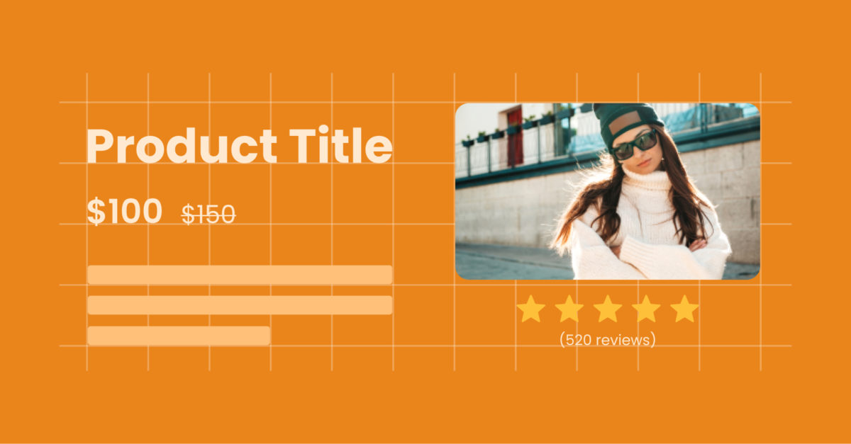
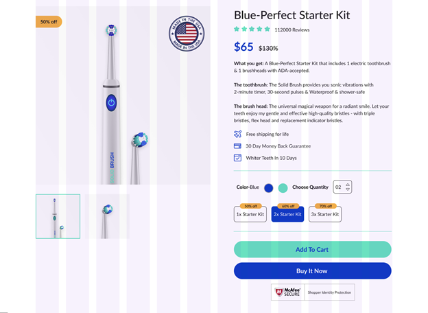
EcomSolid’s toothbrush product page has its product information & benefits texts all left-aligned. Buyers can pleasantly read all the information, including the product title, price, description, and so on.
If you have only a small amount of text, or texts that are headings – definitely go for center-alignment. The same goes for this example:
Headings with small texts should be center-aligned for the best visual experience.
Right-alignment is the default for the right to left reading languages. In other cases, we can see right-aligned texts in rather art elements such as quotes with dynamic settings like break-out text blocks or navigational elements.
Right alignment can also be seen on data & numbers such as pricing.
Justified texts are rare in web design since they tend to stretch a full-frame length & are hard to adapt to different screen sizes.
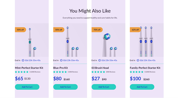
To provide a better reading & skimming experience for customers, you can also mix the text alignments like what Amazon did to their product listings:
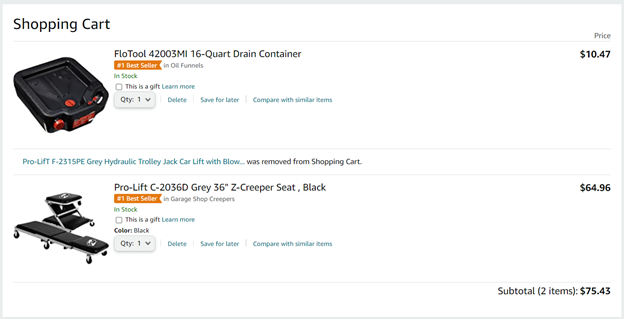
The symmetry between the left-aligned product information and the right-aligned prices makes it easy for customers to quickly assess & compare the information.
Image alignment
You should align your images based on their size and how they correlate to other elements in the design. You can go left, right, or center. Still, note that there are different practices for each type of image.
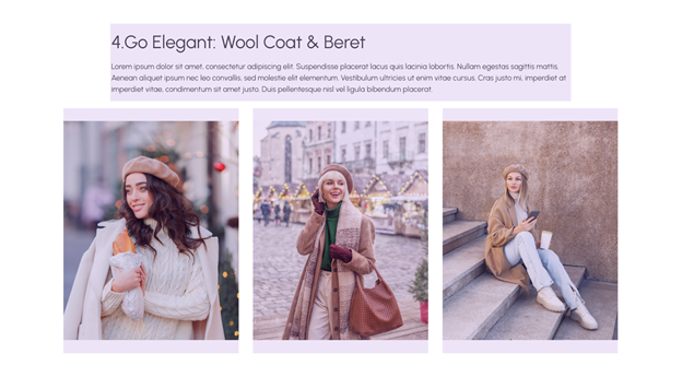
For smaller images, alignment can be somewhat easier because they don’t disrupt the content flow. Here is an example:
Small images align nicely and sit within the content flow.
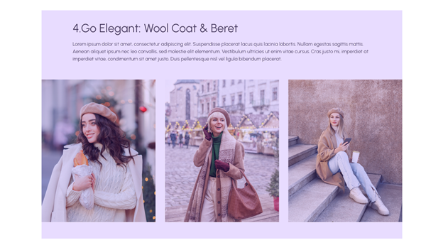
Larger images are harder to align. For instance, if you want to align a big image that is outside of your content flow – maybe between paragraphs or at the beginning or end of your content: Place the image at full-width and center it within your content space.
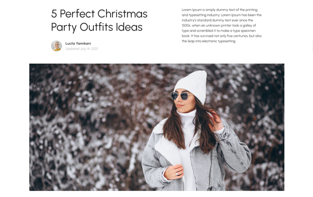
A full-width image outside of the content flow can showcase your store’s design dynamic looks & captivate buyers’ attention.
The thing about full-width is that it doesn’t allow space for anything else. So if you have other elements to showcase, consider aligning the image to the left or right.
The image is nicely left-aligned with the text beside it.
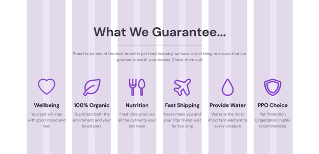
Group of elements alignment
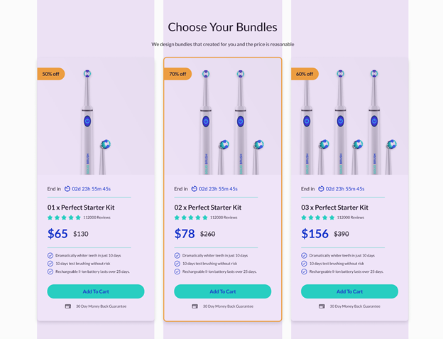
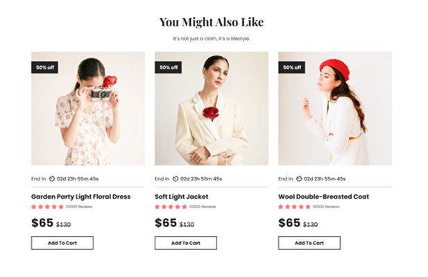
There are 2 ways when it comes to alignment for a group of elements. One, you can align each element in the same direction. This method works when the elements are often related & near each other. The below sample is a well-aligned group in the Solid Fashion template from EcomSolid:
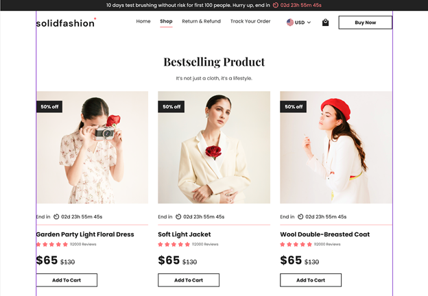
The product list section – including repeated groups of elements with the product image, countdown timer date, product title, rating, price & a “Add To Cart” button – is aligned with the 2 margins of the container to create a sense of unity, reducing clutter in the general layout.
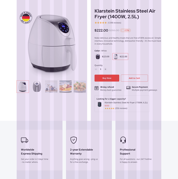
Otherwise, not everything needs to be aligned. Mixing alignments enables you to be creative & enhance the visual interest of readers, but remember, some rules still apply!
In this example, the designer balances out the left-aligned text section with a mixed image alignment.
Avoid these mistakes when aligning a group of elements:
- Too many elements in a group without proper order
- Messy & lost of aesthetics, which makes your store harder to read
In a nutshell, if there’s one thing to remember, we want you to be mindful of both the functional & the aesthetic side of elements to align/group them appropriately. Otherwise, since there is no one-size-fits-all solution here – the advice is to test it out yourself!
Final words
Now that you already know about the practice of grids & alignment in web design – it’s high time you utilized all this knowledge into designing a high-converting, professional eCommerce website! Take the first steps. Try dividing your site into grids, then grouping elements to apply the appropriate alignment for each.
If you need a quick solution, EcomSolid is here for the rescue! See all the examples in this article – they’re all ours. The app has various templates for themes & pages to custom your Shopify store, professionally designed with grids & alignment best practices in mind. Install the EcomSolid app, start with the 20-day exclusive trial, and begin aligning to convert!
P/s: To further step up the game, we suggest you read 8 clean & minimal ways to display eCommerce products or learn how to add custom CSS to your Shopify store.